
 Rebranding of heritage names has become
something of a fashion trend recently, what with Hedi Slimane’s
conversion of Yves Saint Laurent’s ready-to-wear to Saint Laurent Paris;
Pinault-Printemps-Redoute’s transformation into Kering, complete with
little owl pictogram: Celine’s new minimalism courtesy of Phoebe Philo,
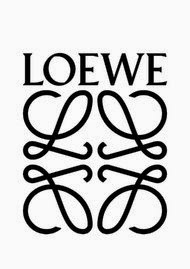
and so on. The latest entrant into this group is LVMH’s Loewe,
under the creative directorship of Jonathan Anderson (aka J Anderson,
iconoclastic Young British designer), which unveiled its new logo and
typeface yesterday.
Rebranding of heritage names has become
something of a fashion trend recently, what with Hedi Slimane’s
conversion of Yves Saint Laurent’s ready-to-wear to Saint Laurent Paris;
Pinault-Printemps-Redoute’s transformation into Kering, complete with
little owl pictogram: Celine’s new minimalism courtesy of Phoebe Philo,
and so on. The latest entrant into this group is LVMH’s Loewe,
under the creative directorship of Jonathan Anderson (aka J Anderson,
iconoclastic Young British designer), which unveiled its new logo and
typeface yesterday.
The general rationale for this is that it
communicates both internally and externally the new identity and vision
of a brand or group, and rationalizes the changes in product aesthetics —
though sometimes the requisite publicity drumroll can make it feel more
like, well, dogs marking their territory. Sometimes the associated
outcry (see Saint Laurent hoo-ha,
which can be summed up as: What! They dared mess with the hallowed
past! Why, oh why?) is less than ideal from a brand perspective. Which
often makes me wonder if the payoff is actually worth the effort.

The old Loewe logo.
I have to say, I kind of like the new swirly,
less formal Loewe logo, which is similar but still different from its
previous incarnation, but I am also not convinced that, had it not been
introduced with a big old publicity drumroll, I even would have noticed
(and I am pretty sure most consumers would not).
Given that the new identity took the brand,
according to Mr. Anderson, seven months to create in conjunction with
the Parisian creative agency M/M,
and given that we seem to be living in an age of logo fatigue (or so the
conventional wisdom goes for the sudden downturn in LV and GG sales in
some areas of the world, the rise of Bottega Veneta, with its “when your
own initials are enough” tagline) and logo super-irony (see: Alexander
Wang’s last collection, and Jeremy Scott’s Moschino), the decision seems
even more worth questioning. So I called up Mr. Anderson to get his
thoughts.
Here’s what he said: “When I started at Loewe
last year, I was really thinking of micro, minimal branding, or that
branding in general was maybe obsolete. Two years ago I was kind of
scared of logos.”
Aha, I thought!
But he went on: “I’m not anymore. I realized
people in Spain really love this brand, and it means something to them;
it has a place in the cultural context.” He also pointed out that there
was a precedent for the rebranding in Loewe itself: the logo had
actually gone through numerous permutations over the years, changing
almost “every decade,” though presumably without the company making a
similarly big deal about it. There is a pillar, he said, in the internal
museum in Loewe headquarters, plastered with the different logo looks.
Anyway, he was just warming up to the theme.
“I don’t know if consumers are bored or sick
of logos,” he added. “Maybe what we need are actually new logos; logos
that are harnessed for the use of the brand. It’s really, I think, about
how you appropriate it. We need to find a balance between the extreme
logo and the disappearing logo. But I’m not shying away from it.”
Regarding this last bit, he means it: he says
the new Loewe logo “will be used all over as a monogram, on leather
goods, stationery,” and so on. It reflects, he said, his thoughts about
the brand, which is that it represents the quest to “find perfection in
normality.”
Since his plans for the brand include a
“Loewe world,” which could at some point extend beyond accessories and
ready-to-wear to “blankets, china, anything that makes sense,” this
means we could be in for a lot more quartets of cursive L’s. Also, if it
works, a lot more such reinventions.


